
Blue Jays Again
 Don Campbell |
 The Blue Jays are back!
It was hard to see this once powerful Canadian baseball franchise slip from its roots, as a representative of Canada, to the hip single-word moniker of simply "Jays". I liked the maple leaf on the logo. I liked the splashes of red. I liked the full team name and the split-font typeface. The logo was iconic to us Canadians. And now, it's back!
 The team's logo has actually changed quite a bit in its relatively short history. When the team came into existence on that cold, snowy day in 1977 (remember, I was there), the logo had a nice stylized blue jay stamped on a baseball, and a bright red maple leaf.
In 1997, it switched it up a bit and put the whole thing on top of the leaf. It was okay. The elements were still the same. I didn't like the font as much, but I could live with it.
In 2003, it lost much of its style, and went with a bat-wielding blue jay wrapped around a letter 'T'. the colours were the same, but it lost something for me. Unfortunately, it was about to get worse.
In 2004, the logo hit rock bottom. Gone was the red. Gone was the "Blue" in Blue Jays. Gone was the split-font. Everything was gone. It was sad, indeed.
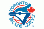
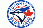
But now, it's ALL back! In 2012, the team will be sporting a logo that has all the elements of the original design. It has the blue jay head on the baseball. It has the splashes of red. It has the split-font typeface. It has the maple leaf. It has the "Blue Jays" name. It has everything. A slightly more modern bird image, and darker colour palette are the main things that distinguish it from the original design, and attempt to tie the various elements from the past together. It's both old and young (kinda like me!), and I LIKE it!
 Well done to the Toronto Blue Jays franchise! You made a great choice, and made your long time fans happy (well, this one at least). Now go out there with your sporty new look, and win us some games!
Don
Reader Comments (1)
Like the overall feel -- but the "Blue Jays" typeface is dreadful. The serifs coming off the B are chunky and ugly